Thursday, 28 November 2013

Drafts of my Music Magazine front cover.


Music Magazine Front Cover Drafts 1 & 2

Here are my 2 drafts. What I would change about this is obviously put my image behind the text, maybe add a bit more text onto the front cover, including the barcode and price, maybe a competition. This would be to make it more messy and more of a rock style. I will also make the plug more of a circle, just to try and make it look nicer as at the moment it doesn't look that nice.

Monday, 25 November 2013

Initial Ideas Mind map - Music Magazine!

Here is my initial idea mind map for the music magazine, this shows what Fonts, photos, cover lines, genre, masthead (title), colours, supplementary photos, price and design that will be included on my magazine front cover. I have now changed the Genre to rock.

Thursday, 21 November 2013

Proposal for Music Magazine


Proposal
I am aiming my magazine at people of all ages that are into indie rock music. The image I expect to use on the front cover is a picture of my friend, but it will be him pretending to be the lead singer in his new, up and coming rock band for the purpose of the magazine. I will go about getting this image by taking a photo of him leaning against a wall, to try and create an rock-ish look. The genre of music the magazine will be focused on will be Rock. My magazine will be about the top 10 rock bands, as well as an interview with the lead singer of the new, up and coming rock band 'Pedicabo diem'. My ideas for cover lines are 'Top 10 rock Bands' and 'Pedicabo diem EXCLUSIVE!'. I have decided on the title of 'NMM' which stands for 'New Music Monthly'. I will be using the font 'Cracked' for my title and cover lines as its a nice, different font. My tagline idea is fairly simple as it is 'New Music Monthly'. I have decided on this as it is simple, and a bit boring, which I think would fit in well with the magazine as it is meant to be an rock magazine. That tagline was for the Title, where as the tag-lines for the cover lines will be 'What do YOU think?!' for the cover line of 'Top 10 rock Bands' and the other tagline will be 'An Interview with the next big thing!' for the cover line of 'Pedicabo diem EXCLUSIVE!'. It will be published monthly, so on the 13th of each month. I have chosen this date as it is usually known as an unlucky number, and with it being an rock magazine, it is different and I thought it was fitting. The cover dimensions will be 210mm wide and 270mm long. The colours I will use on my contents page will be black, red and blue. The text will be white and black, except from the title which will be black with a red outline. The price of my magazine will be £2.50.

Music Magazine Front Cover Flat Plan

Here is my flat plan for my music magazine front cover. It seems basic, but that is just because there is no image but when it actually comes together it will be messy.

Monday, 11 November 2013

Magazine front cover and contents page analysis


Here is my front cover and contents page analysis of a magazine. I have described and occasionally explained some reasons as to why they do some things. Its not the best bit of work, but its the best I can do.

Friday, 25 October 2013

Mindmap of initial ideas

Here is a screen grab of my initial ideas mind map. These are the initial ideas for my Front cover of the student magazine.

Thursday, 24 October 2013

Drafts


Here are a draft copy of both of the front cover and the contents page.

Front Cover and Contents page


 Front Cover and Contents Page


These are my front cover and my contents page. I have gone for a simple and neat look as I personally like that look, as it all seems in order and appealing to me. I have also used fairly basic and simple colours, as again I personally like it and it is easy to see while also being eye catching. I felt the image and front cover went really well as it looks really neat and nice, while being fairly simple and not too cluttered up. I feel that the contents page didn't go so well as there isn't much on it and it very simple, while still being neat, but it does need more information on it. I would improve my contents page by taking more time to make it look nicer and have all the relevant information on. I feel if I did this, it would improve and make the whole thing better overall.

Proposal

Proposal
I am aiming my magazine at Students, as it is a college magazine. My magazine will be about life as a student, the opportunities that are offered to student, benefits of being a student and so on. My ideas for cover lines are about enrichment activities, and celebrating the colleges' achievements and other opportunities they offer. I have decided on the title 'Student Life' as the magazine is about student life, so I thought it would be a fitting title. The fonts that I want to use are 'BlairMDITC TT' for the titles and 'Bank Gothic' for the subheadings and text. My tag lines are 'What one is right for you?' and that is for my enrichment cover line, and my other one is 'Celebrating success with glee' which is also a reference to the main picture as the main picture includes a sign that says 'Celebrating Success' and the person in the image is holding a leaflet about a glee club. It will be published at any time of the year, except the academic holidays such as the half-terms and end of term holidays. The image I shall be using on the front cover is of my friend holding up a leaflet about glee club, a leaflet about 'Stoptober' while next to a sign about celebrating success. I have got this image by taking a picture of him holding up the leaflets next to the sign with a smile on his face. The magazine would be published monthly so the competition prizes and vouchers will be of a reasonable and respectable quality. The dimensions for the magazine are 21cm wide and 27cm long. The colours I will use on my contents page are mainly black, but the text will be white, except from the title which is white, with a red outline.

Flat-plan of my front cover

This is the flat-plan for my front cover. I have created this and used it to help me by giving me a rough idea of what i should have on the front cover of my magazine and I have gone by it, while adding more, to create my front cover.

Monday, 14 October 2013

My first attempt at InDesign

This was my first attempt at using InDesign, I used the text tool, the frame tool and i fitted the image to the frame when i needed to. I also used the Swatches tool, where I changed the colour of the text, and he outline of the text, which was made via the stroke tool.

Thursday, 3 October 2013

To what extent should magazines be held responsible for the social ramifications of the representations they offer?

To what extent should magazines be held responsible for the social ramifications of the representations they offer?


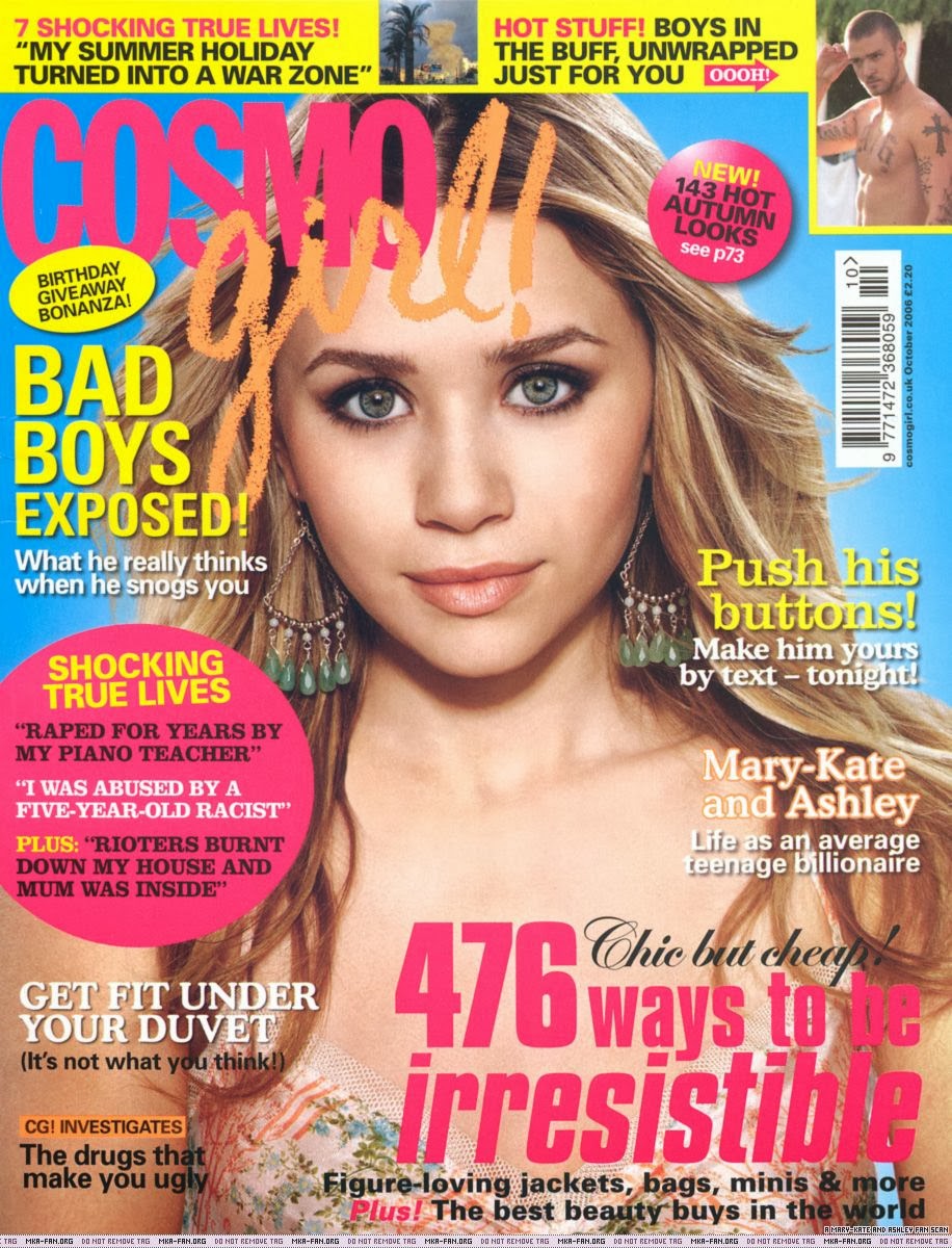
These magazines are all aimed at young girls, and More! and Cosmo Girl focus on looks and sex, where as Bliss isn't as sexual or beauty orientated, but still features something on beauty, that being "Look prettier TODAY! 10 instant tricks to try right NOW".
The issue of More! that I am using as an example is focused on fashion, sex, weight and hair, which isn't really what people want their young, impressionable daughters reading weekly or how ever frequent these magazines come out. I feel that this is wrong, seeing as these magazines have readers as young as the age of 12, and by exposing them to this type of information and making them focused on boys, sex or self image at that young age is also wrong. I don't think parent would want their young daughter to be subject to such an intensity of un necessary information for that age, when their minds should be focused on other things that wont have such an effect on their self confidence and so on.
The issue of Cosmo Girl I am using as an example is about Boys, how to get boys, beauty and how to look "irresistible". Again, allowing this content to such young, impressionable girls is wrong as they shouldn't have to worry about boys and beauty at such a young age, when they should be focused on things such as their education and friends. It also has an article included in that specific issue that seems to focus on how to manipulate a boy, wit the title being 'Push his buttons! Make him yours by text - tonight!'. This issue also uses euphemisms, 'Get fit under your duvet (It's not what you think)'. What they did there was imply something that could be interpreted as sexual but then they say it isn't what we think.
The issue of Bliss that i'm using is probably the most innocent of all of the examples I have used. This isn't as much about sex and boys as all the other ones, but obviously still has it, just less obvious. This magazine seems to focus on fashion, modern day social media, love and ways to improve their self image. This could be more acceptable in the eyes of society  as it isn't pushing sex and make up towards the audience, but more fashion and modern day technology and social media. It would be better if the magazines currently out there for teenage girls were more like this as it could cut down on how much they focus on self image and make them more focused towards more innocent ideas and modern day going ons, like keeping up to date with their favourite TV shows etc. I feel there should be more content including things such as music and keeping them up to date with news, while making it more appealing to the younger audience. I think this would be acceptable in the eyes of the public and could reduce the blame of magazines influencing young girls in todays society. 

Analysis

Analysis
     This magazine is aimed at a wide age range of people that are interested in football and reading about football. The layout of the cover is quite simple as it displays the main information about that issues focus (this one being about BVB Dortmund being an up and coming team), with a picture of their manager and top talents being displayed. The main cover line stands out by using a large text and contrasting colours, which are also the colours of Dortmund's kit. It also displays most of the masthead, but although the image covers a fair proportion of the masthead up, there is still enough shown to know what magazine it is.
     Most of the other cover information is displayed in the right third, which is different to other magazines, who commonly display it in the left third. They also have the plugs on the right third, which displays information about the feature story and a picture about another story. In the top strip, above the masthead, more information is displayed, and in this example, one is a competition to play at Wembley, with the other showing a snippet of an article in the magazine. In the bottom strip, another article is being displayed, this time a picture of the two of whom the article is about.
     The barcode is in an ideal location as it is simple and easy to see, all the information on the barcode is visible.
     Displayed at the lower section of the right third is a cover line, but it doesn't take up much room on the cover and it stays in the right third section. It shows the main information about that selected article and a little bit of extra information. The cover has attempted to appeal to the audience with contrasting colours on the cover, which stand out and catch the readers eye and by being nice colours it almost attracts the reader to the magazine. 
     The main cover line may cut through the image, but it doesn't cut off too much of the image and you can still identify the players and manager. It is all nicely laid out with the information being in its own space and not being interrupted by other information and stories. I feel that all the necessary information is being shown to attract a reader or new customer to the magazine and get them to purchase it. 
     The colour scheme is really impressive as it uses attractive colours that do catch the readers eye. The use of the black and yellow is good as not only are they contrasting and nice colours, they also are the colours of the feature teams kit and their badge. 
     Again at the bottom of the page the use of red when talking about two of Liverpool's players is clever as red is, and always has been, the colour of Liverpool's kit. The subheading of the cover line about Liverpool is also clever as it is a gold like colour, which is also the colour of their badge. This is nicely done by the designers of the magazine.

Monday, 30 September 2013

Examples of Terminology used in Magazines!

Examples of Terminology used in Magazines!

Here are 15 examples of Terminology used in Magazines:

  1. Left Third = The left third of the magazine cover is important for sales in shops where the magazine is not fully shown.The title is easily recognised in the sea of magazines that surround it. 
  2. Cover Lines = These are lines that give short snippets of the magazine that grab the readers attention and make them want to buy the magazine.
  3. Puff/ Plug = These are shapes on the cover that are used to display important bits of information, but they are in shapes so it will stand out on the page.
  4. Masthead = This is the title used to make the readers familiar with the magazine they are reading.
  5. Number = Numbers are used to make it seem like they have asked a lot of people and got a lot of results to back up the idea that they want to put out. The numbers are either completely random or rounded up.
  6. Colour Schemes = Colour schemes are used for visual effect. The effect being that it looks pretty and attractive and makes the information and/ or pictures on the page or cover to stand out. 
  7. Main celeb/ image = An image is used on the front cover of magazines as they want to make their magazine seem amazing as they have the celebrity of the moment or a 'hot and now' celebrity. They can also used images from games or videos to make the front cover look nice.
  8. Barcode = This is a typical barcode that has been on magazines in the UK since the late 1980's.
  9. Main cover line = This is similar to the cover line, except this one is about the main story and usually includes a quote from the story underneath.
  10. Selling line = This is seen as an introductory headline below the masthead which describes the magazine.
  11. Tag = A word or phrase that is used to grab the readers interest, usually words like "exclusive" and "sensational", which are both exciting words.
  12. Top and Bottom strip = These are areas at the top and bottom of the cover that gives further information to what is to come inside the magazine.
  13. Serif = This is a type of font that "has feet", these 'feet' are flicks at the ends of the letters to make it look more fancy.
  14. Sans Serif = This is another type of font that doesn't have "fancy feet" and looks more modern and sleek.  
  15. Drop = This is where the first letter of the article tends to be larger or in a different and elaborate font.

Monday, 23 September 2013

AS Media Blog Introduction

Things you can do with Blogger!
Here is a bullet point list of things you can do with Blogger:
  • You can blog easily
  • You can publish and/or share videos and multimedia to your readers and followers
  • You can share information, coursework and stories/tales with your readers and followers
  • You can even earn money! You can do this by posting high-quality, original content on your favourite topics. Blogger has a dedicated Monetise tab that allows you to easily place 'AdSense' ads on your blog.
  • You can develop your community! This is done by adding the followers gadget and allows your readers to follow your blog.
  • You can post on the go
  • You can create an "About this Blog" and a "Contact Me" page.
  • You also have a personalised domain name!
How I think Blogger will be useful for my coursework!
Here is a bullet point list of how I think Blogger will be useful for my coursework:
  • It is easy to use, write blogs that include coursework and to publish the pieces of work!
  • It is free to all users!
  • It is easy and simple to edit and update frequently!
  • It is easy to access, so it is easily marked
  • Feedback can be given really easily via comments!